How to make a good app wireframe – here are our thoughts
Table of Contents
Every project needs a plan, a prototype. It’s no different with software – actually in every release. Whether you’re creating a mobile application or a browser application, you need a wireframe in the software world. All of this is to ultimately get a valuable product that will allow your business to grow.
It’s a little bit like the travel plan with the wireframes. You must have an outline of what needs to be done, how it should be done, and you must have a plan for everything. This action plan must also be tested to see if it will work. After that you just need to start implementing it. Of course, it’s a huge simplification, but it perfectly reflects how important the wireframes are. Absolutely not to be missed! It is up to the wireframes, among other things, whether your clients will be satisfied with the mobile application you offer them. There are a lot of things to be satisfied with – from the stability of the platform to the proper distribution of options on the screen and, for example, an understandable purchase process.
Creating a good wireframe. What should your wireframe creation plan look like?
In fact, there are plenty of ways to create a wireframe. However, it is worth highlighting the universal points that should be included in your plan. Omitting them or forgetting about certain rules may cause your wireframe to be difficult to implement (for example, it will turn out that there is a significant UX flaw in the finished product). It should be avoided, or at least the risk of such a case should be minimised. This is why you need the best possible wireframe.
Read also: Is a Security Token Offering Your Best Choice?
How should the creation of a wireframe look like?
Think how the user flow should look like.
When you start planning the wireframe, it’s worth having a clear idea how your application should look like. This is mainly about the outline of what the user needs to do to get a specific result. If you do not understand this process, it is worth imagining it in the form of “canoeing”. – how will a user cross a given route to reach the finish line and what things might surprise him/her on that route. What can happen during the journey, what can stop the user (and thus cause problems?).
It is also worth taking into account that the user can use different ways to solve a specific problem – this is why “user flow” cannot be linear. During the life of our service we will meet various users who have different habits.
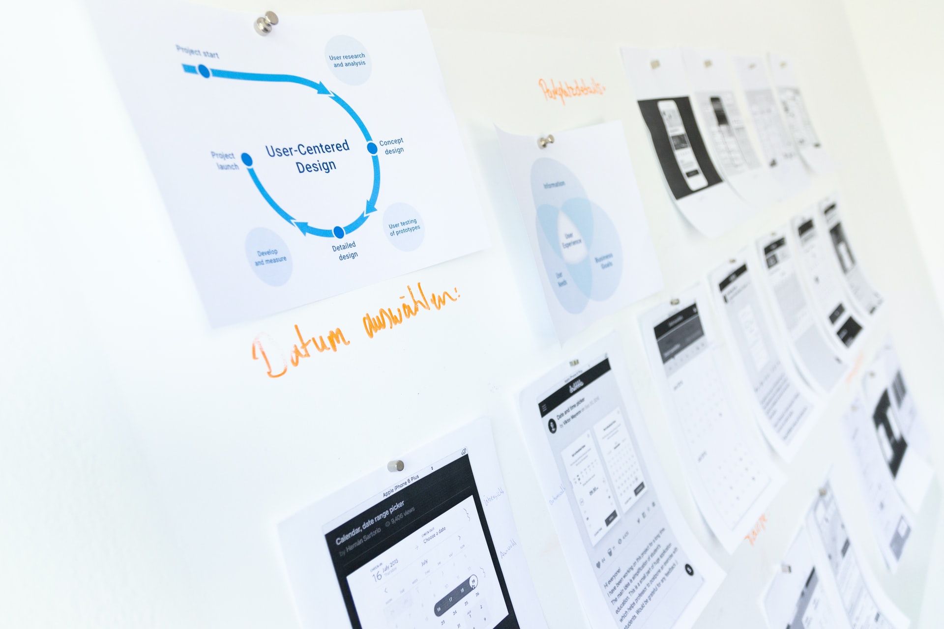
It is worth to visualize the “user flow” with arrows, boxes – on paper or with the help of a digital tool. If you have ever created graphical algorithms, you will know how to create a clear and transparent “user flow” that will allow you to understand how your application’s wireframe should look.
Sketch and ask
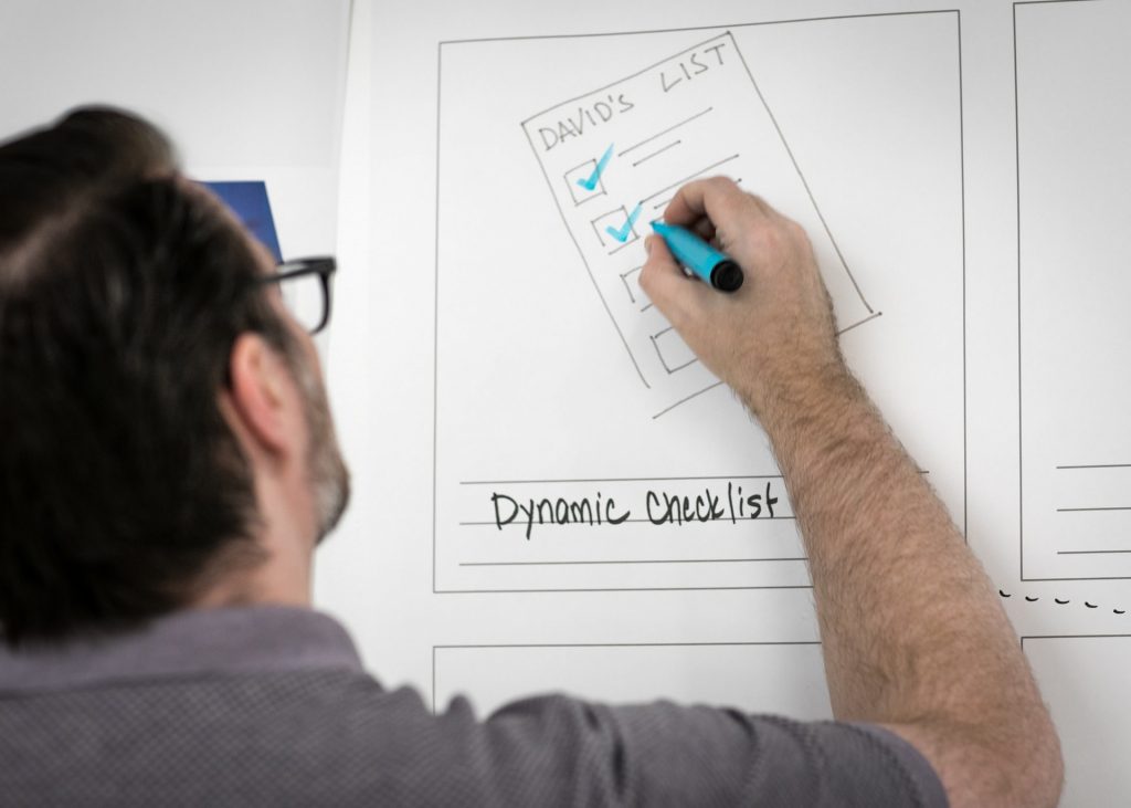
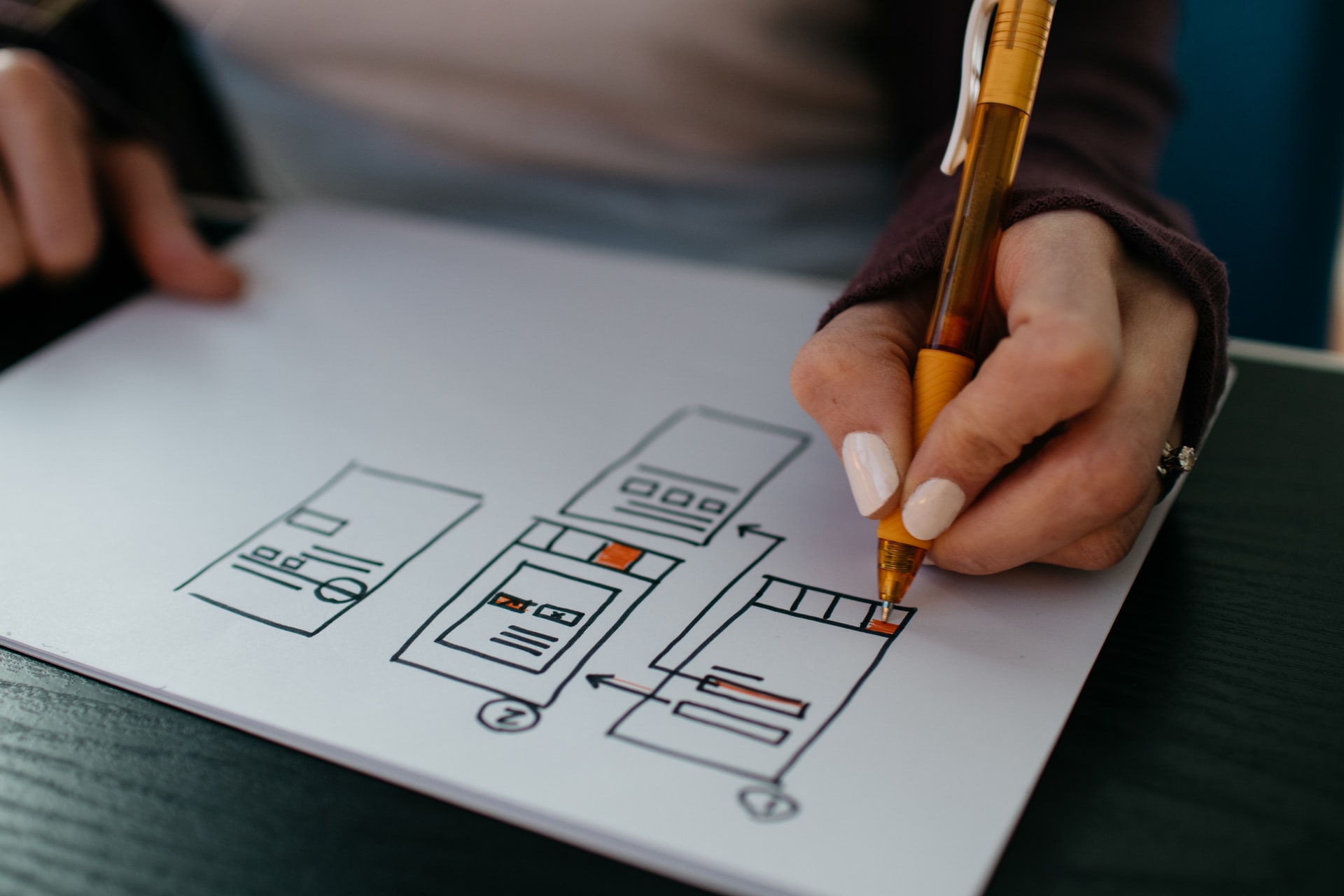
Visualizing “user flow” is a very important thing. Putting it on paper before making a working prototype is the part that will allow you to systematize the most important design assumptions and include several ways to solve a specific problem in a sketch.
Why shouldn’t you create a digital prototype of your project at this stage? It may turn out that after it is done you will be less eager to modify it, you will treat it as “fully binding”. At the sketching stage you will not only be able to make changes to your project – it will be much easier to gather opinions about your “user flow”. Whether it’s your colleagues, superiors, friends, family – everyone can introduce something interesting to your sketches, notice a problem that no one else has noticed. It’s worth supporting yourself with such opinions and introducing more iterations. All the time you have to keep in mind that a particular screen / view has certain goals. It is worth asking yourself specific questions about these views:
“What is the purpose of this view? What is the user supposed to achieve with it?”
“How does this view help the user to achieve a specific goal?”
“What can be changed in this view to make it even easier for the user to achieve his goal?”
“Do my competitors solve these problems in an easier way? How is my solution different from other similar ones?
 Wireframing
The sketches you’ve created before will be a great help in creating the right wireframe. Mid-fidelity wireframes are extremely useful in the context of further discussions about the final shape of the project e.g. with designers and developers. The quality of the wireframes depends on whether the project is properly understood – this in turn determines the success of the whole project. This should be kept in mind at every stage.
When developing a mobile application it is worth creating a “Mobile Frame”, but it is not worth falling into the trivial traps that may be associated with it. Yes, it is possible to base the wireframe on any rectangle and thus create our proper “sketch”, but from the very beginning it is worth taking care of our later convenience. So it is worth using the screen dimensions of the device for which we create our project (using e.g. reference equipment). This way we will avoid a situation in which we will place too many elements on the screens, which with non-standard dimensions could be a big problem for us. It is worth to start designing from devices with “medium” screens – let’s say if you are creating a mobile application for Android, it is worth to choose a reference hardware with a screen size of about 5.8 inches.
Starting the first phase of building the wireframe, you must establish a clear visual hierarchy. You are creating a structure of information on the screen, but at this point you are not yet focusing on the right “content”. However, you should consider how you want to present the content on the screen. You should also think about the order of the materials you show – all to be clear about what you will be dealing with at this and that moment. Here, you need to consider aspects such as the specifics of user consumption (e.g. scanning the screen from top to bottom, from left to right).
What is well known is… good
It’s no secret that well known patterns are liked. It is not without reason that “people like those melodies they have already heard”. It is no different when it comes to the design of any project. If you come across a mobile app that is similar to another, you will find yourself in it much faster. That’s why competing programs are very often twinned in terms of design. That’s why e-mails have a very similar layout on the screen.
In terms of unifying the interfaces of mobile applications, Google and Apple have introduced certain patterns into their ecosystems (e.g. Material Design in Android). These approaches are called “design languages”. – it’s a set of recommendations for building interfaces that help developers to create accessible, good-looking projects. It is worth to use such aids, as they are very important signposts – based on the experience of many specialists.
Fill the screens with text
When you manage to create the final hierarchy of content on screen and you will be satisfied with it. Once you feel that you have done all the iterations possible for your project and can no longer improve it, you can think about starting to add text to your wireframe that should be on your screen. We warn you against placing the so-called “lorem ipsum…” here. – it’s a very common mistake when creating a wireframe. “Lorem ipsum” can and does allow you to look at the project in a more “natural way”, but it absolutely does not respond to several important problems while creating the interface:
“Is the text understandable to the user in combination with the space available to him?”
“Will the placement of a given text not cause problems during the interface development”?
“Does the text fully exhaust what we want to communicate to the user?
“Can the text be built better – in the context of the user and the design of the project?”
Wireframes supplemented with text should also go through several iterations. It is worth (again) to consult other people and ask them if the texts are built for them in an understandable way and explain 100% of what is important for the whole “user flow”. It may also turn out that some elements of the user interface may not be needed when we put the text on the screens – that’s why it’s worth adding a “living” text to the wireframe – the one we would like to see in the final version.
Why else should you put “real” text on your prototype? At this stage it will not be difficult to change the hierarchy of elements on the screen. It may turn out that significant changes in the layout of the screens are needed, and the text can be extremely helpful in establishing the right order. Therefore, placing such subtitles is very important – it is also a much better idea than adding the standard “Lorem ipsum…”. It can be used when presenting graphic elements, but it should be definitely avoided when creating prototypes.
Scalability of screen elements
Just because you create screens for devices with specific screen sizes will not mean that your design will look as good on larger devices. Think about those models of phones or tablets that have bigger and smaller screens. Don’t forget that while it’s safe to create “medium” screen size models, you still have to consider other devices that also have slightly different display proportions, or the so-called “notch”. Such aspects should also be taken into account.
Create a good UX flow
Individual screens can be beautifully made and perfectly thought-out. But you have to remember that your design must be coherent and clear for the user. It cannot be a collection of random content that will be displayed without a clear hierarchy. If the UX flow – a process that will allow your user to understand how the program works in the sense of “whole” – is not transparent, your project will not achieve the desired success. You have to take care of such things as the “special states” of the program when processing the requests. Your task is to make the user believe that everything works as it should and is predictable for him. That’s why it is so important, for example, to place an interactive “Please wait a moment” screen with an interactive element between the search screen and the results presentation. The backend must have some time to process the user’s request and return the relevant results, right?
Additionally, the user must know at critical moments what is wrong with his request. Let’s assume that the user has to enter the data needed to deliver the order. He should know what has been typed in the wrong way so that he can do it absolutely correctly in the next attempt. If he is not able to do it after our message, he will probably be discouraged and abandon the “flow”. He will be dissatisfied with the outcome of the application and will be a “lost customer” for us. And nobody wants that. Therefore, at every stage we have to consider whether the screens present the state of the application in the simplest and clearest possible way. It is also worth making sure that the user is still confident that our application is simply working – it has not “suspended” and even if a certain process takes a long time, everything is fine.
It is worth discussing such problems with our co-workers, as well as with the shareholder or client. Don’t be afraid of testing either – look for solutions that will make the UX Flow more user-friendly.
 Read also: Single page applications: How to create successful software?
Summary
It is worth remembering some basic tasks while building the wireframe:
- It’s worth to start by building a detailed flow, writing it down on a piece of paper (or in a graphics program). Don’t be afraid to ask! Many people can provide very interesting suggestions for your project!
- It’s worth considering what problems are solved by a specific screen, a specific flow in applications. Keep in mind that there are users who have different habits and can try to achieve specific goals in different ways. You should help them and take into account their most important habits.
- Do not rush to create the right wireframe. The “free” versions can be changed in any way you want and create new iterations.
- “Live” content is better than “Lorem ipsum” – allows for a better hierarchy of texts on screen. We will thus avoid situations in which we place too much text and have to cut out large portions of it.
- The creation of wireframes should be started on medium-size reference devices, but remember to scale them into larger and smaller displays.
- The user still has to be sure that your application works well. It is worth thinking about such areas to keep it that way and point out the elements that can cause problems.
- Communication with the user is the most important issue. Clear, transparent messages are of great importance – if the user understands how your project works, they will stay with it for longer.
This may interest you:
Cross-platform mobile application – which technology you should choose?
Mobile app development cost – how to create an estimate for your project?
How to make a rapid prototype for mobile apps?
UI for mobile apps – How to create a nice and useful product?
Mobile application – 5 good reasons why you should integrate social media
How to improve your mobile app with conversational UI
What’s the cost of developing a mobile app?
Mobile App Designing: A Step by Step Guide
Investing in a mobile app – 6 good reasons for business to allocate funds
Single page applications: How to create successful software?
Native app vs. hybrid app – which one should you choose?
Java vs Kotlin: which is better for Android Apps Development?
What is Flutter? Here is everything you should know
JWT authorization: How does it work for web applications?